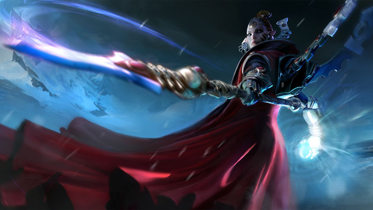
Art Director Matt Kuzminski walks us through the process of redesigning Macha from the ground up. Take it away, Matt!
We last saw Farseer Macha over ten years ago, in the first Dawn of War. Not only has Eldar design evolved since 2004, but the character herself has grown. The events of Dawn of War challenged a lot of Macha’s perceptions, maturing her into a more thoughtful and objective leader.
For Dawn of War III, we wanted to reflect that change and portray her not only as a capable warrior and commander, but as someone who can shape the destiny of her species.
2D Concept
One of the central pillars the art team follows is to design for gameplay first. Quick digital sketches are great because they tell us right away if the general shapes and vibe are going to work at a distance while still capturing the essence of the character. Detail and subtlety are difficult to convey in the gameplay camera view, so overworking the concept in the 2D stage doesn’t guarantee it’ll translate seamlessly to 3D. We’ll touch more on this further down!
One of the biggest changes for Macha was the removal of her helmet. Despite being a big fan of Eldar Farseer helmet designs (and having modelled more than a few myself), the story we want to tell in Dawn of War III requires us to see her face. In this initial concept exploration, you can see me playing with the idea of a Greek Hoplite-inspired look and incorporating a helmet that doesn’t obscure her features.
Without spoiling too much of the story, Macha doesn't take things at face value. That's a very important part of her character in Dawn of War III. We wanted to capture a lot of these elements in her portrait - visionary, warrior, priestess, legend. This is an early example of that. The strong facial structure is there, but as the story evolved, the tribal haircut didn’t serve the direction we were heading.
This was a sketch exploring a different vibe - high priestess, alien, circular. I ended up referring to this one as my “weird little sketch”. Although it’s a far cry from the final design, I wanted to show it because it really solidified a lot design goals for the team. We liked the high priestess vibe we got from the concentric elements radiating from around her head - it looked ornate, but not cumbersome to wear. It all culminated in portraying Macha as a wise and knowing leader, even though just a few elements were incorporated into the final design.
3D Concept
Earlier I mentioned that overworking the concept can work against us. The nature of the camera in an RTS means the player spends most of their time looking at our characters from a distance. How the details of the character compress into a few pixels on the screen while conveying sophistication close up is something that is best worked out in 3D. In other words, 2D concept art can only take us so far when it comes finalizing the character in-engine. Details that look amazing in a 2D concept can look confusing, noisy, or unrecognizable in the game’s camera view.
Once More, With Details
In 3D, we are able to test shapes quicker, so you start to see Macha’s design evolve more rapidly at this stage. After the shapes are blocked out, that’s when we can start layering in all the small details that bring a character to life.
I want to make a quick shout out to the passion our artists have; our character modeller Lee Salo was so pumped about Macha that he started sculpting her face in his free time before we had fully settled on a direction. And once he'd seen my “weird little sketch” of Macha, he turned it from an interesting exploration into an epic, fully realized design.
We check in regularly with the narrative designers and Game Director Phil Boulle to make sure we're meeting the creative goals of the story and the game. As we began bringing Macha into the 3D space and tightening up her look, it became apparent that we’d landed on a direction the whole team was happy with. Once the model was locked down, it was time to work out the materials and colour palette!
Final Touches
Here we’re getting close to finalizing the design, although we hadn’t solidified the colour palette. The Biel-Tan white of her robes just felt a little off, and we ended up finding that a red cape met our goals much more effectively. Turning red into the primary colour had the added benefit of helping her stand out more prominently on the battlefield. In this stage, we also tweaked the materials for the different parts of her armour - making sure the cloth reads as cloth in stark contrast to the Wraithbone.
I couldn’t be more excited to share this new take on Macha - wiser, deadlier, and more sophisticated than ever. And I can’t wait for you guys to see the role that Macha has to play in Dawn of War III. To see her in action, head over to the Eldar faction page!


